Blog
Over the years, I’ve written a lot of blogs on several sites. Some of my favorites are here, mixed in with my original content. Enjoy.

Experience Rot affects full-site redesigns, too
So often as designers, we try to out-do the previous site – adding on design elements and movement and "surprise and delight" and bells and whistles and new content and and and AND—

Can you iterate your way to great UX?
Agencies do a lot of big-bang website redesigns – projects where everything changes all at once. For marketing sites, this usually isn’t a problem. But it can be a problem when used for intranets, asset management systems, member service portals – applications, in other words.
Here’s how to deal with it.

When "improvement" becomes experience rot
Better doesn’t mean more, and it may not even mean adding at all. When you undertake a re-design, think long and hard about what you add. Because often— more is less.

Image Optimization for Non-Engineers
Big images can make a page slow. But how big is too big? What kind of image do I use? WTF is a jay-peg anyway? What’s wrong with my ping file, it looks great?
I get these questions often enough that it’s worth writing up the answer for posterity. Here are some rules of thumb for the best image formats by use type, and a quick primer on the 6 most common image formats used on the web.

Design isn’t something you “like”
We can’t talk about how good it is unless we know what design is.

Do Homepage Carousels Work?
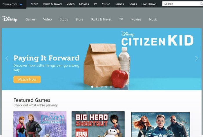
Whether you call them slideshows, rotating banners, multiple offers, or carousels, you’ve seen them. You visit a new website, see a big banner or hero graphic, and a couple of seconds later, it changes, then changes again. They’re really popular. But do they work?
Here’s the data from the research. Spoiler: It’s pretty damning.
